

What is a User Crosstab?
Workday’s BIRT (Business Intelligence and Reporting Tools) is a powerful way to generate reports from all the data within Workday. The types of reports that can be generated with BIRT range from simple, department-level information to company-wide, sophisticated business insights.
In BIRT, a user crosstab is a type of report element that displays summarized data in a table format. A crosstab report allows you to analyze large amounts of data by grouping it according to specific criteria. Users can interact with the crosstab by manipulating the data, such as pivoting the table, sorting, filtering, and drilling down into details.
User crosstabs are called “user” because they allow end-users to customize and interact with the report at runtime. They can dynamically modify the layout of the crosstab and apply their own grouping, filtering, and aggregation criteria. This allows users to explore data in a more interactive way and drill down into the details of the report to gain insights into the underlying data.
Workday BIRT provides a user-friendly interface for creating crosstab reports, with drag-and-drop functionality to add data and configure the layout. The user crosstab report element can be added to a BIRT report design using the report designer tool. Once added, you can customize the crosstab by defining the rows, columns, and measures that make up the report.
The intent of this article is to give you a step-by-step walkthrough on how to utilize crosstabs in the Workday BIRT report design template.
Examples of User Crosstabs in BIRT:
Sales Report – This user crosstab report displays sales data for different product categories over time. Users can pivot the table to view data by month, quarter, or year and drill down into the details of each category.
Employee Performance Report – This user crosstab report analyzes employee performance metrics, such as sales targets, customer satisfaction, and attendance. Users can filter the data by department or location and sort the table by different measures to identify top performers.
IT Asset Management Report – This user crosstab report shows a summary of IT assets by category, vendor, and location. Users can filter the data by asset type or department and drill down into the details of each asset to view its configuration and usage.
Financial Analysis Report – This user crosstab report compares financial data for different business units or projects, such as revenue, expenses, and profitability. Users can pivot the table to view data by quarter or year and sort the table by different measures to identify trends and outliers.
Customer Survey Report – This user crosstab report aggregates customer feedback data from multiple surveys and displays it by product, region, or demographic. Users can filter the data by survey question or response and drill down into the details of each survey to view comments and suggestions.
These are just a few examples of the types of user crosstab reports you can create in BIRT. The possibilities are endless, and you can customize the reports to suit your specific needs and requirements.
Step by Step process to create Crosstabs in BIRT
Here’s a step-by-step guide to creating a user crosstab report in BIRT:
Open a new BIRT report design and select the data source that contains the data you want to analyze.
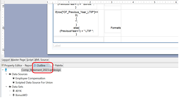
This can be any one of the Data sets that exist on your BIRT report design template. The data sets are visible under the outline view of your BIRT template.
Outline View on Workday Studio
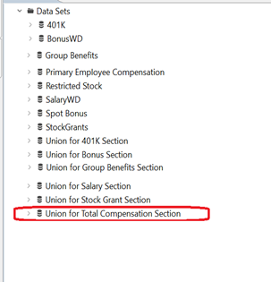
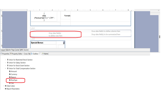
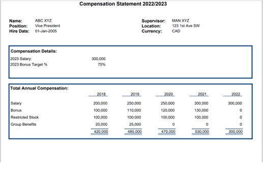
For the purpose of this blog, we are selecting the secondary data set “Union for Total Compensation Section,” which is the union of all the individual data sets, such as 401K, Bonus, Group Benefits, and so on.
List Of Data sets available to act as source
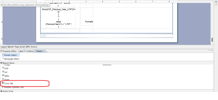
Drag and drop a crosstab element from the palette onto the report canvas.
You will find the crosstab Widget from the Palette Window In Workday Studio.
crosstabs in Palette
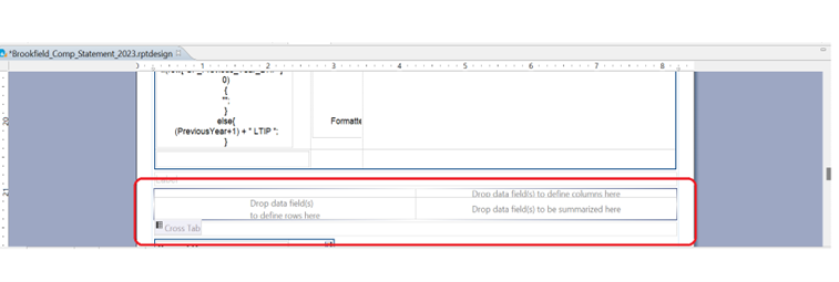
After dropping the crosstab, a general Layout of the crosstab appears with three important sections.
- Section to Define Row Type
- Section to Define Column Type
- Section for Summarization Fields
After Dropping crosstab on the Report Template
In the crosstab wizard, select the data fields you want to display in the rows, columns, and measures of the crosstab. You can also set up filters, sorting, and aggregation options for the data.
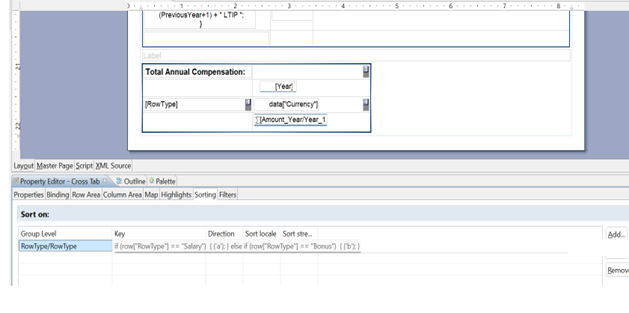
Drag the Row Type Column from Union for Total Compensation Section Data set and drop it on the column to define the Row.
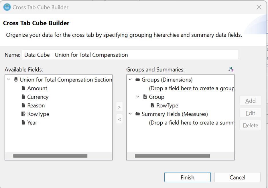
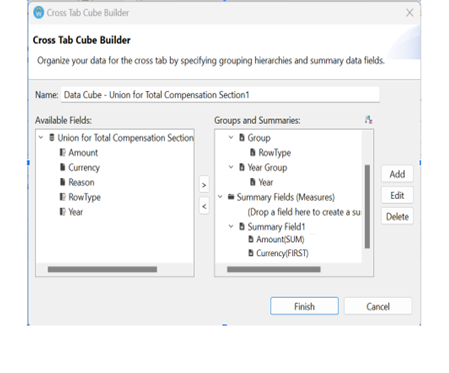
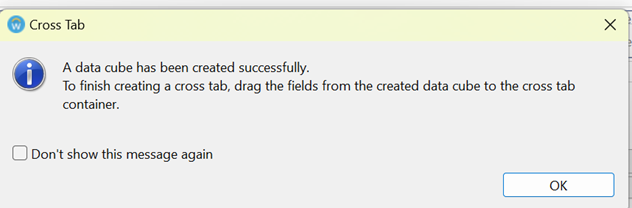
This will prompt the crosstab Cube Builder to pop up.
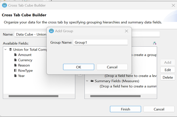
Pull the Year Field and create a new Year Group under Groups (Dimension). Add Group Name.
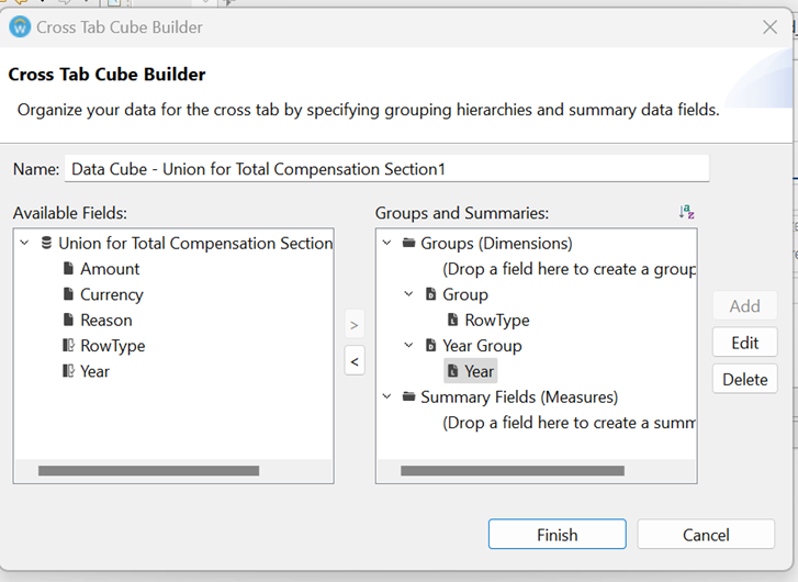
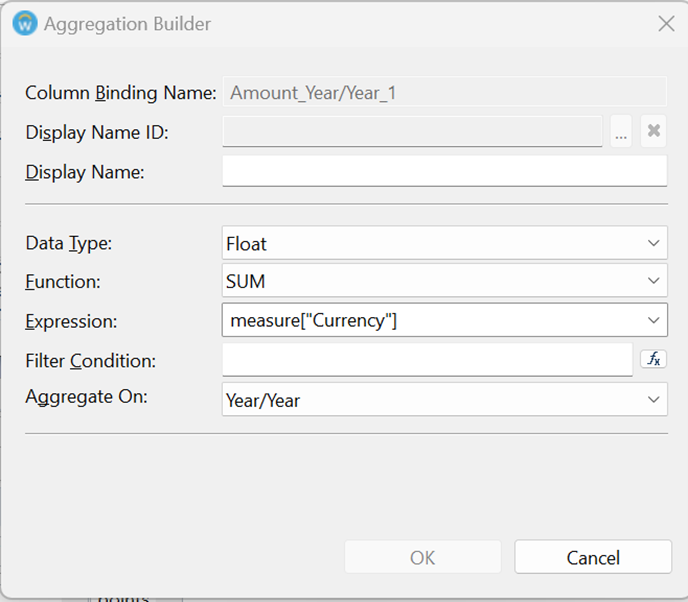
Pull the Amount Field and Currency Field and place them under Summary Fields and Click on Finish.
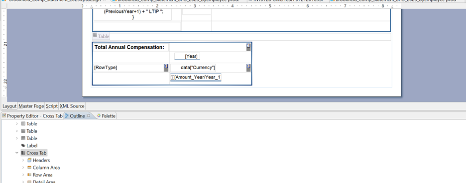
Drag the Row Type Column from Data Cube – Union for Total Compensation Section Data set and drop it on the column to define the Row. Similarly, drag the Year Field and drop it on the area to define the columns. Amount and Currency Fields are to be dragged and placed in the summarization section of the crosstab.
(Please note for the purpose of the blog, we have deleted some of the default labels that appear on the crosstab and formatted the crosstab to meet some formatting requirements. Please update the crosstab as per your design).
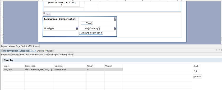
You can set up Filters using the properties tab and filter out Row Type or Column Type by adding specific conditions.
You can set up sorting using the properties tab and sort out Row Type or Column Type by adding specific conditions.
You can also update Aggregation or change Aggregation Logic using the Aggregation Builder.
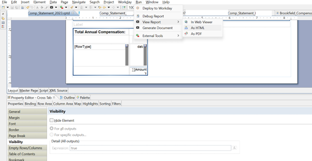
Preview the report to see how the crosstab looks and behaves. Customize the look and feel of the report by adding headers, footers, and formatting styles.
You can preview the reports by going to Run > View Report > As PDF.
Save the report design template and publish it to a BIRT report server or export it to a variety of formats, such as PDF, Excel, or HTML, by attaching the Business Form Layout to Workday Custom Reports.
Summary
Workday BIRT crosstab functionality is a very handy reporting tool, especially when you have to group data based on different metrics. Large volumes of data can be displayed in a readable format, with substantial flexibility to refine and restructure reports depending on user requirements. If you would like to learn more about how to get the most out of BIRT functionality, including how to best use crosstabs, please contact us.